My 2001 Mobile Computing Rig
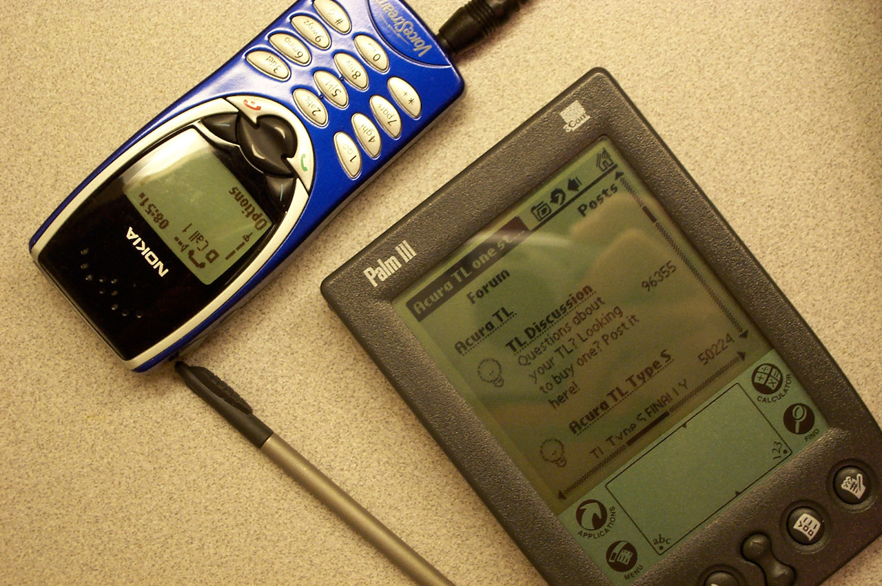
My 2001 mobile computing rig: 3COM Palm III, running Palm OS 3, Blazer browser with web page compression proxy, connected via IrDA to a Nokia 8120 on the VoiceStream GPRS data plan.
Shot with a 2MP Kodak DC3400 Zoom digital camera.
What a difference a decade makes.
Copyright ©2013 Dave Rahardja