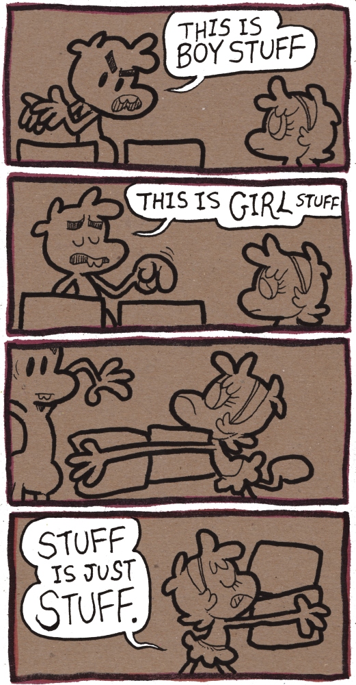
Stuff — shmorky
Yup.
Yup.
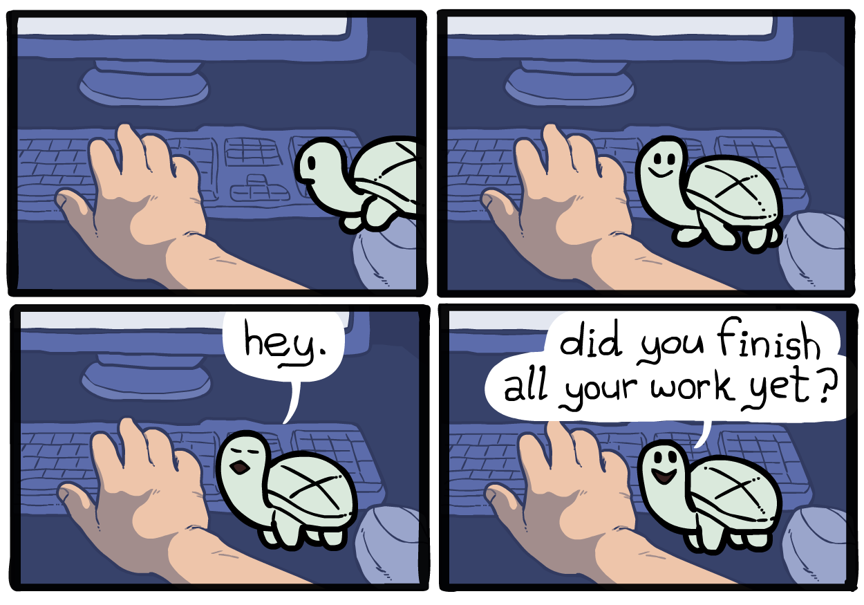
your desk turtle
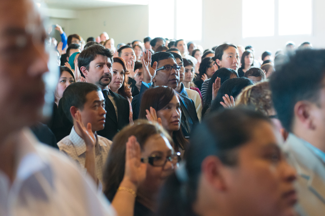
Naturalization Ceremony, Campbell CA
Copyright ©2014 Dave Rahardja
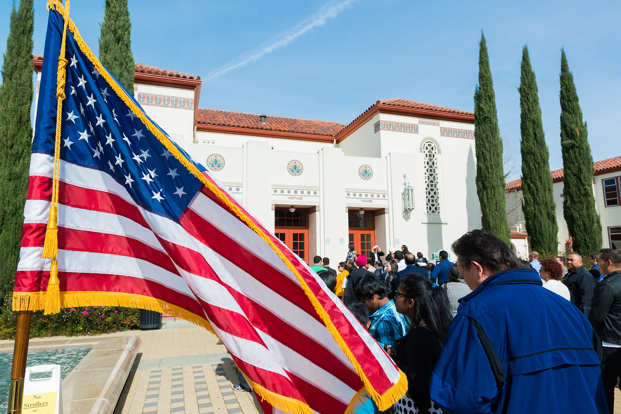
Heritage Theater, Campbell CA
Copyright ©2014 Dave Rahardja
Cupertino, CA.
Copyright ©2014 Dave Rahardja
Copyright ©2014–2026 Dave Rahardja. All rights reserved.
Any use of this website’s contents without prior written permission is subject to licensing fees.
You may not use any part of this website for machine training.